You have about three seconds. That’s roughly how long a visitor spends deciding whether your SaaS landing page is worth their time. In those three seconds, visuals do most of the talking. Not your headline. Not your pricing table. Your visuals. And nothing communicates “this product is polished and trustworthy” faster than a well-crafted laptop mockup showing your interface in action.
But here’s the thing: most SaaS brands treat mockups as an afterthought. They grab a generic frame, slap their screenshot inside, call it a day, and wonder why their conversion rate flatlines. Using a laptop mockup the right way is a genuine competitive edge. Let’s talk about how to do exactly that.
Why Mockups Are Conversion Weapons, Not Just Decorations
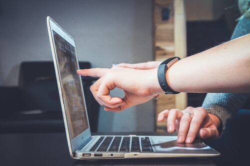
There’s a psychological reason mockups work so powerfully on landing pages. When a visitor sees your dashboard inside a realistic laptop frame, their brain automatically contextualizes the product. It stops being an abstract screenshot floating in white space and becomes something tangible — something they can imagine themselves using at their desk tomorrow morning.
This mental bridge is enormously valuable in SaaS, where your product is intangible by nature. You can’t hand someone a box. You can’t let them squeeze the packaging. The mockup is your packaging. It signals quality before a single word is read.
Done right, a hero section featuring a sharp, photorealistic laptop mockup accomplishes three things simultaneously: it establishes credibility, communicates the product category instantly, and creates an emotional pull toward signing up. Done wrong, it communicates carelessness at the moment trust is most fragile.
Choosing the Right Angle and Composition
Not all laptop mockup angles serve the same purpose, and choosing the wrong one is a surprisingly common mistake. A full front-facing shot works beautifully when you want to showcase a dashboard with dense information. The viewer gets maximum screen real estate, and your UI becomes the undisputed focal point.
A three-quarter perspective adds dimension and depth. It feels more editorial, more aspirational. This angle pairs especially well with minimal, whitespace-heavy interfaces and works brilliantly in feature sections where you’re telling a visual story.
Side or isometric angles create a sense of product ecosystem — ideal when you want to show multiple screens or stack a laptop alongside a phone or tablet to communicate cross-platform reach. The rule of thumb: match the angle to the story you’re telling, not to whatever looks cool in isolation.
Best Practices That Actually Move the Needle
Here’s what separates landing pages that convert from ones that look nice but don’t:
- Show real UI, not placeholder content. Visitors are smart. They notice when a dashboard is full of “Lorem ipsum” or suspiciously perfect fake data. Use actual screenshots from your product, even if it means designing a polished demo state specifically for marketing.
- Match the mockup style to your brand. A dark-mode laptop frame for a youthful developer tool reads very differently from a clean silver MacBook frame for a corporate HR platform. The hardware aesthetic shapes brand perception.
- Use shadows and lighting intentionally. Flat, shadowless mockups feel cheap. Realistic drop shadows and ambient light reflections make your product feel premium before anyone reads a word.
- Keep the background purposeful. A cluttered background competes with your UI. Minimalist environments, subtle gradients, or clean desk surfaces keep eyes exactly where you want them.
Real Examples: How Laptop Mockups Are Used in SaaS
Look at the landing pages of top-performing SaaS companies and a pattern emerges immediately: nearly every high-converting hero section leads with a product visual inside a device frame.
Project management tools frequently place a laptop mockup front-and-center in the hero, showing a colorful board view with real task names and team avatars. The effect is immediate: visitors understand the product category, see the visual hierarchy of the UI, and get a gut feeling about whether the software feels right for them. No paragraph of copy does that as efficiently.
Analytics platforms often go a step further, layering a laptop mockup alongside a floating stat card or a phone screen to imply a connected, multi-device experience. This visual shorthand communicates “your data everywhere” without a single word of explanation.
Customer support tools use mockups brilliantly in feature sections, scrolling the visitor through use-case scenarios — the inbox view, the ticket dashboard, the reporting panel — each scene set inside a clean laptop frame that keeps the experience cohesive from top to bottom of the page. The mockup becomes a narrative thread.
Even email marketing platforms, whose UIs are relatively simple, use angled laptop mockups in campaign showcase sections to make template screenshots feel like finished products rather than flat images. The device frame adds authority and context that a raw screenshot simply cannot.
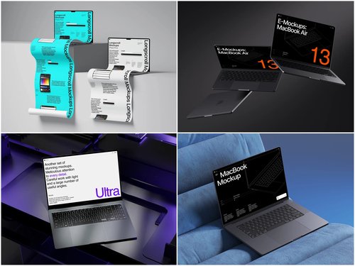
Premium Laptop Mockups on ls.graphics
If you’ve been searching for mockup resources that actually match the quality your product deserves, ls.graphics is worth knowing. Their collection sits in a different league from the generic freebies scattered across the internet.
What makes them stand out starts with rendering quality. Every file is built with ultra-realistic detail: accurate reflections, nuanced material textures, and lighting that looks like it came from a professional photo studio. The result is mockups that feel photographed, not fabricated — exactly the impression you want visitors to carry away.
Here’s what you actually get when you work with their files:
- Ultra-realistic rendering. Accurate reflections, nuanced material textures, and studio-quality lighting make every mockup feel photographed rather than generated. Your UI inherits that credibility instantly.
- Organized, labeled layers. No archaeology required. Drop your screenshot into a clearly structured smart object and you’re done — minutes, not an afternoon.
- Multiple angles and perspectives. Front-facing hero shots, three-quarter editorial views, dramatic isometric angles — the right composition for every section of your page is already there.
- Color style variety. Silver, space gray, midnight, and more. The hardware aesthetic matches your brand, not the other way around.
- Stylish minimalist compositions. Every scene is designed with breathing room built in, so your UI stays the focal point rather than competing with environmental clutter.
Ease of use ties it all together. Smart object layers, clean file structure, and ready-to-use scene compositions mean you can go from blank file to finished landing page asset in the time it takes to drink a coffee.
Placement and Hierarchy on the Page
Where you place your laptop mockup matters almost as much as the mockup itself. The hero section is the highest-leverage placement — visitors encounter it before they’ve scrolled a pixel, and it sets the emotional tone for everything that follows.
Feature sections benefit from mockups too, particularly when explaining a workflow or highlighting a specific capability. Placing a mockup directly adjacent to a feature description creates a show-don’t-tell dynamic that copy alone can’t achieve.
One placement pitfall to avoid: using the same mockup angle and composition repeatedly throughout the page. Vary your angles across sections to maintain visual interest and give each feature its own distinct identity. Repetition breeds invisibility, and an invisible visual is a wasted conversion opportunity.
Conclusion
A laptop mockup is not decoration. On a SaaS landing page, it’s a conversion tool, a trust signal, and a storytelling device — all compressed into a single visual element that loads before your visitor consciously decides to pay attention. Getting it right means choosing the correct angle, showing real product UI, matching hardware aesthetics to brand identity, and using compositions that keep your interface front and center.
If you’re serious about that first impression, ls.graphics makes it significantly easier to achieve results that look genuinely premium without draining your design budget or your team’s time. Because in SaaS, the brands that look trustworthy at a glance are the ones that earn the click. And the click is where everything begins.